Online Signing & Notarization - Foundational Redesign
During the pandemic, business effectively stopped for many customers because in person notarization was not available, Remote Online Notarization (RON) solved their problems. To address this customer need DocuSign acquired a RON platform. To ensure brand trust and increase design and engineering efficiency, we committed to applying DocuSign’s design system to the product.
“Our signers are executive level - RON is a huge time saver…3 minutes from login to logoff, before our exec would have to drive to the UPS store and drive back…”
— Customer Quote, VOC session
My Role
Primary Product Designer, and sole designer dedicated to the project. I worked on a cross-functional team with members representing Product, Research, Engineering and Design Systems.
Outcomes
Fixed 10/15 usability issues that had been identified and improved accessibility.
CSAT score 4.2 to 4.7
Why did we even go ahead with a redesign?
Usability & Accessibility
The UI failed very basic best practices and accessibility standards eg. some buttons didn’t look clickable and some did even though they were not, color contrast failed basic standards for text and so on.
Efficiency - Design & Engineering
Save time in the future for Design & Engineering teams Engineering team were keen to get off of Bootstrap and onto using DocuSign’s design system for efficiency going forward (for both Design and Eng!). We were also able to move straight to Ink
Brand Trust
Customer’s choose DocuSign because we are a trusted brand and visually the acquired product didn’t represent DocuSign. In the Notary and Digital Signing industry, Trust is of the utmost importance. It wasn’t acceptable for DocuSign customers to be landing on a product that looked like a different company all together with ‘legacy’ styling.
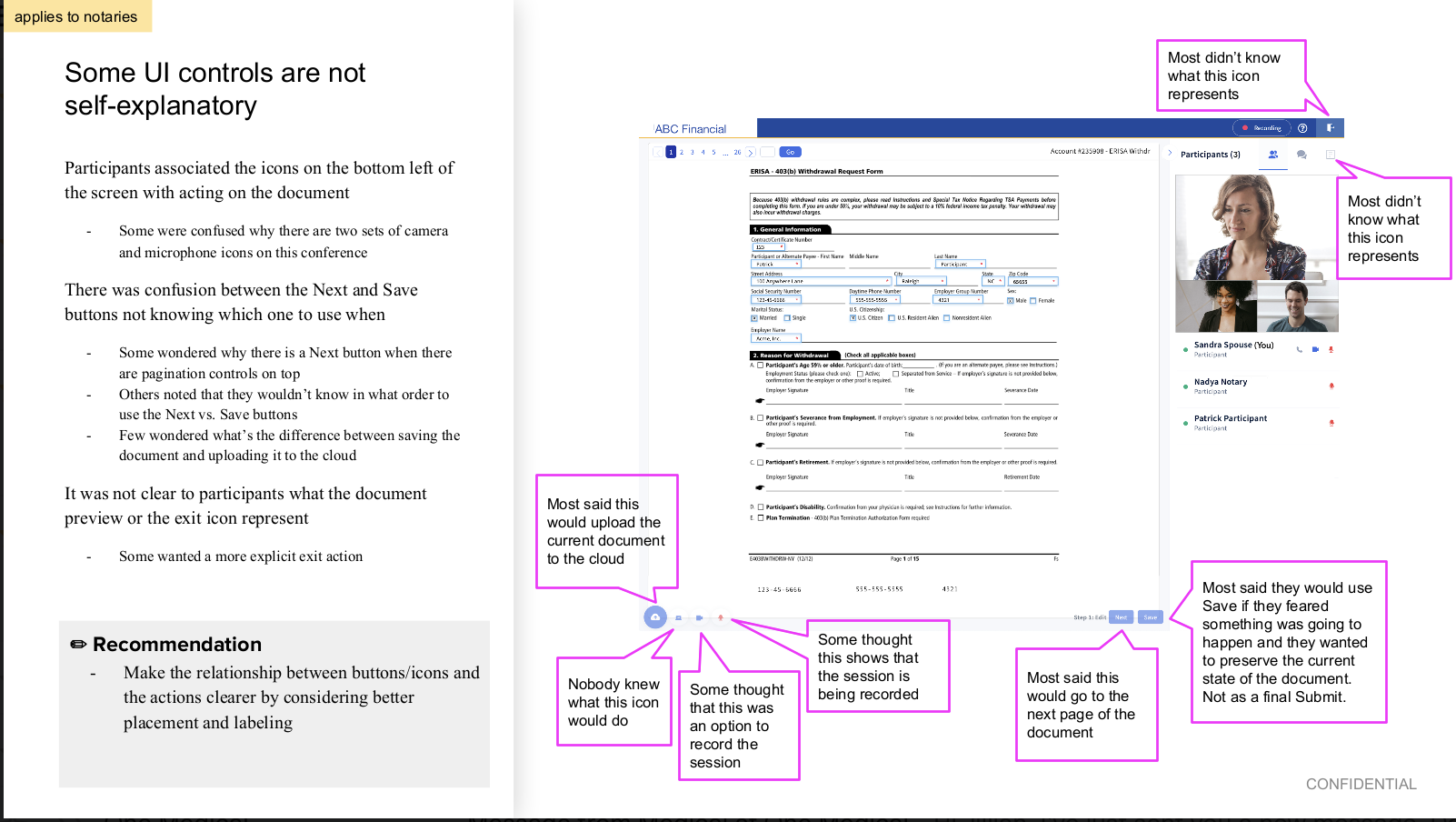

We had the findings of one moderated usability test to help guide us.
We had limited research resources, but moderated usability testing was conducted on the end to end experience of the product. The results were mainly qualitative. In addition to UI concerns, usability issues were discovered.

I was nominated to lead the foundational redesign.
After a senior designer left the company, resources were short and I was the only designer dedicated to this project.
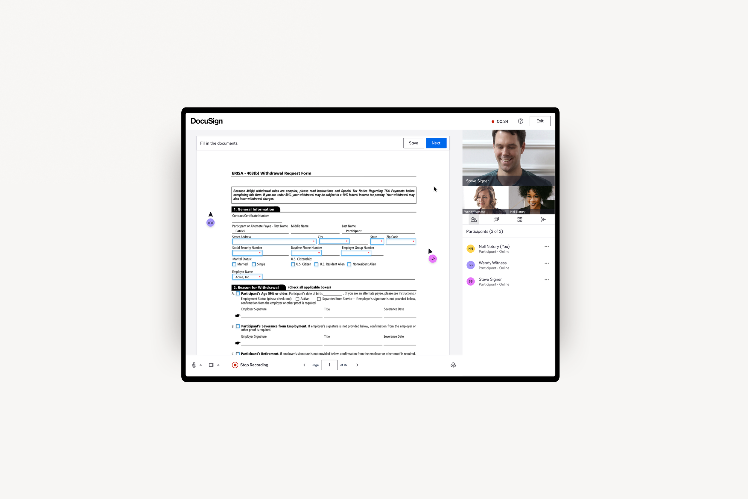
I was tasked with applying the DocuSign design system to primarily the Collaboration Room, as part of the process we did an audit of every aspect of the Collaboration Room and converted systematically.

This was a year long effort that required dedication and organization.
Each of the 15+ ‘features’ I worked on is a story in itself. Below is a selection.
Action Status Bar

Audit

Design specs
Header & Recording

Annotations for the Header & Recording project

Dark mode exploration

Content guide
Toasts

Toasts before & after
Challenges
Limited Resources
We didn’t have time to conduct further research and so used the single usability study to help guide us. I was also the only designer dedicated to the project.
Scope Creep
The company DocuSign acquired also used their platform to support non Notary use cases. There was a lot of scope creep / friction around whether we were applying the new Design System to both the Notary and non Notary flows (the non Notoary product was being sun-setted, but still had legacy customers).
Avoiding ‘Dalmation’ effect
Leadership handed down a mandate that we couldn’t have live product with visible ‘Dalmatian’ effect - that is 2 design systems on a single screen - so we had to be strategic about which screens to convert first, and when net new features were actually released to production. We used Launch Darkly to manage this - but was definitely a source of friction for all to figure out when to release what.
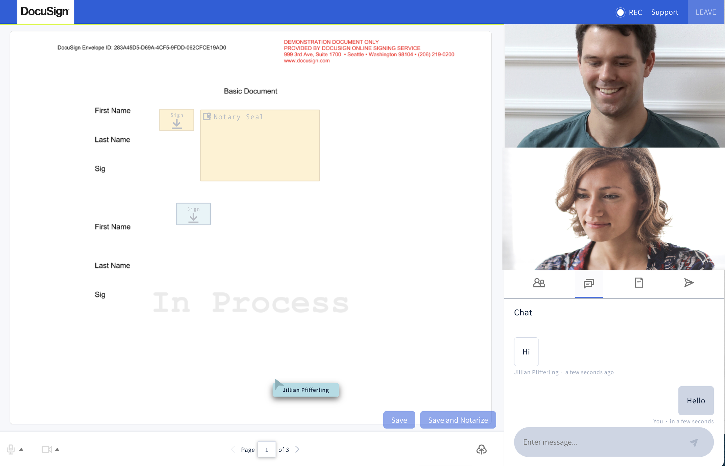
One highlight was working on ‘Chat’ with the Design Systems an Motion teams
In some cases, the Design System didn’t have the components we needed because the DocuSign had never had products/features that included Chat, Personalized Cursor and so on before - so I collaborated closely with the team to get what we needed. The Chat feature was a great chance to explore and make sure it would be reusable for others.
Before

After
After tireless efforts we achieved 100% conversion of the Collaboration Room.

After
Before

Learnings
OUTCOMES
CSAT score improved from 4.2 to 4.7
100% applied the Design System to the Collaboration Room and Tech Check experiences.
Made a big step to get the Dev team off of bootstrap, which will also help them when we build new features going forward.
10/15 usability issues that were found in first testing were resolved.
Solved glaring accessibility issues.
Product looks and feels trustworthy and represents DocuSign’s brand.
Successfully lead project as primary designer.
TAKEAWAY